

Project Formline
Hello everyone!
This page is meant to be a place where I can show early concepts and gather feedback from people who care about keyboards and how they look. The project is still in its early stages, so the goal here is not to present a finished product but to explore different directions and learn along the way.
A Premium Case Without Going Luxury
I want to explore what a premium yet accessible 80% keyboard case could look like. Something positioned between entry-level metal cases and very expensive enthusiast designs.
Designed for Performance-Focused Users
The case should appeal to people who care about performance and build quality, but also want something visually refined on their desk.
Focus on What the User Sees
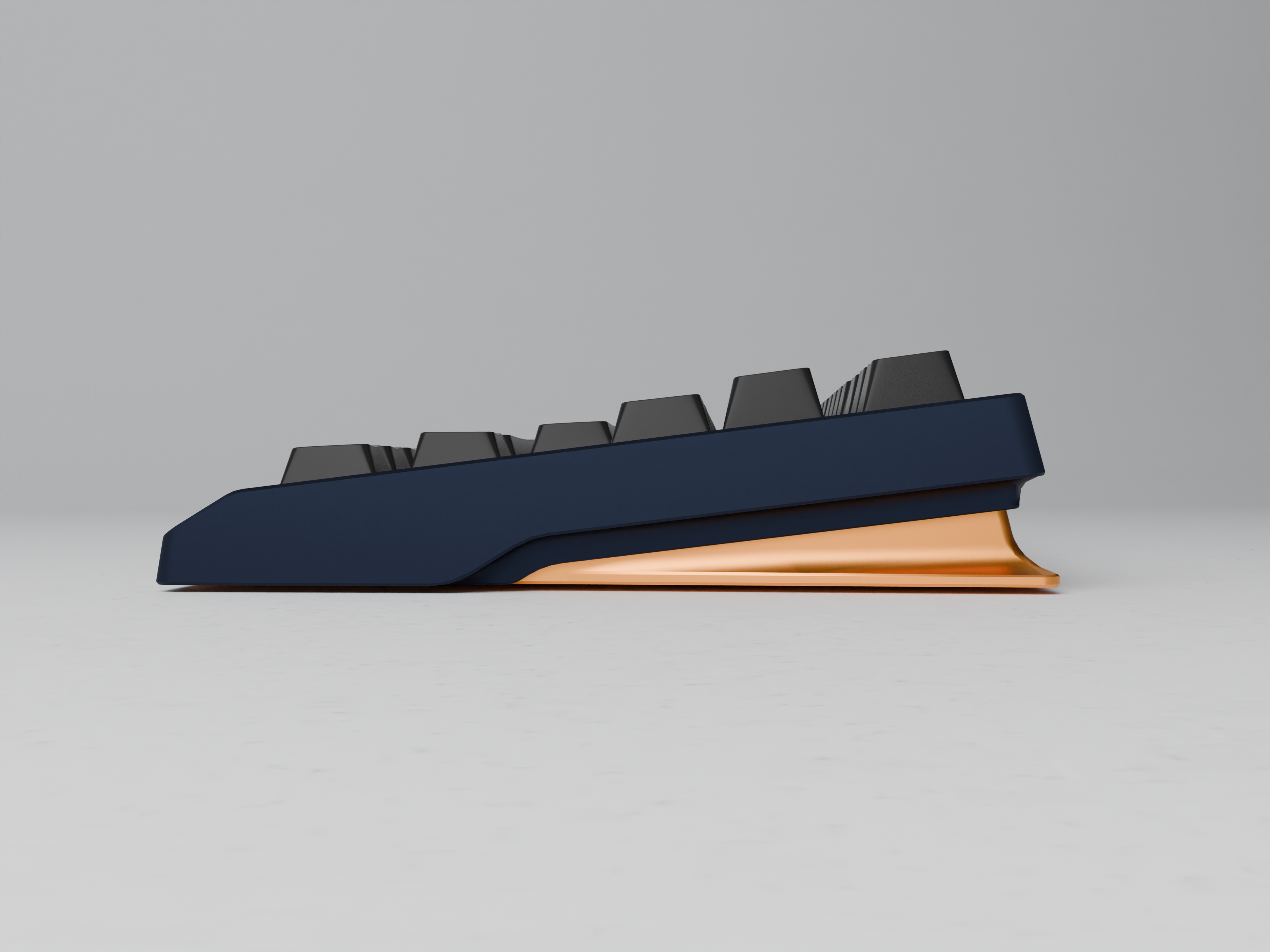
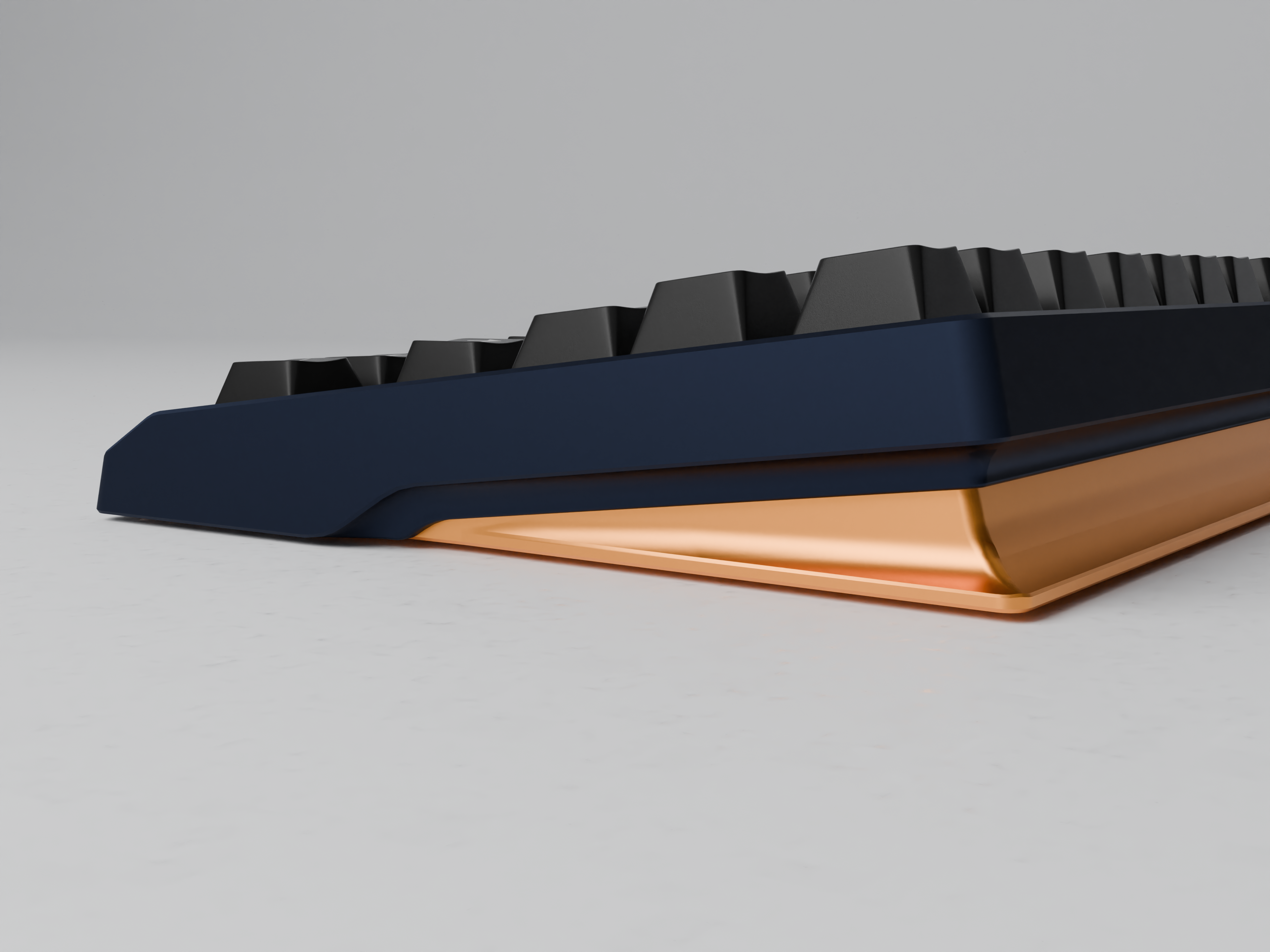
The focus of the design is on what the user actually sees and interacts with. The top surface, the front profile, and the overall proportions should carry the perceived value visual identity. Less attention is placed on decorative elements hidden underneath the keyboard.
Competitive and Fair Pricing
The case should remain fairly priced compared to competitors in the same category. The goal is to stay within the range where enthusiasts can justify it as an upgrade without entering luxury territory.
EARLY CONCEPT DISCLAIMER
Before diving into the renders, a quick note. These are very early concept explorations. Many of the details are still being tested and refined. Colors and finishes in particular should not be taken too seriously at this stage. They are mostly there to help visualize form and contrast.What I’m primarily looking for feedback on is the overall design direction and your personal opinion.
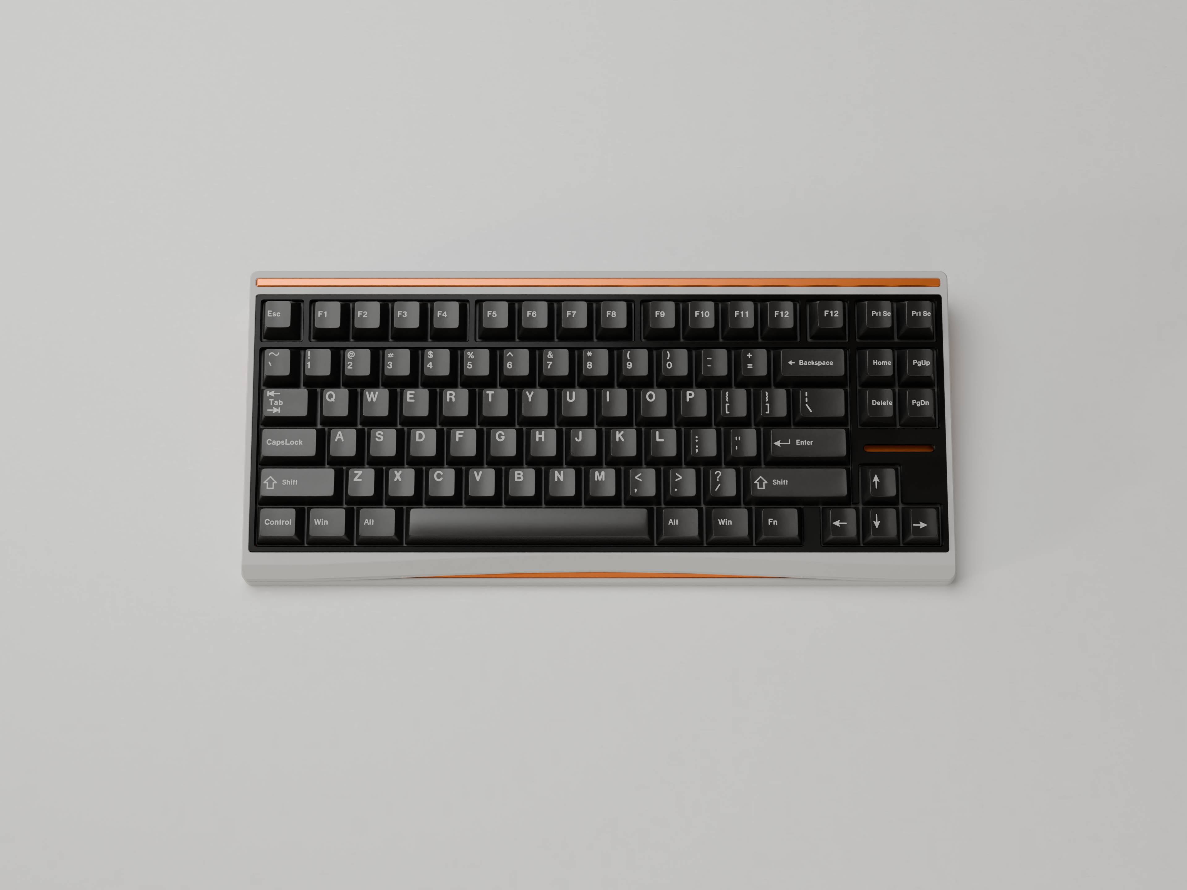
WHY THE TOP SURFACE MATTERS
One design principle I’m exploring in this project is shifting attention to the areas that are actually visible during use.
Most keyboards spend their lives on a desk viewed from above and from the user’s perspective. Because of that, I’m experimenting with designs where the top surface, front profile, and overall stance carry most of the visual identity.
Instead of focusing on decorative elements hidden underneath the keyboard, the goal is to create something that looks intentional and refined from the angles that matter most.
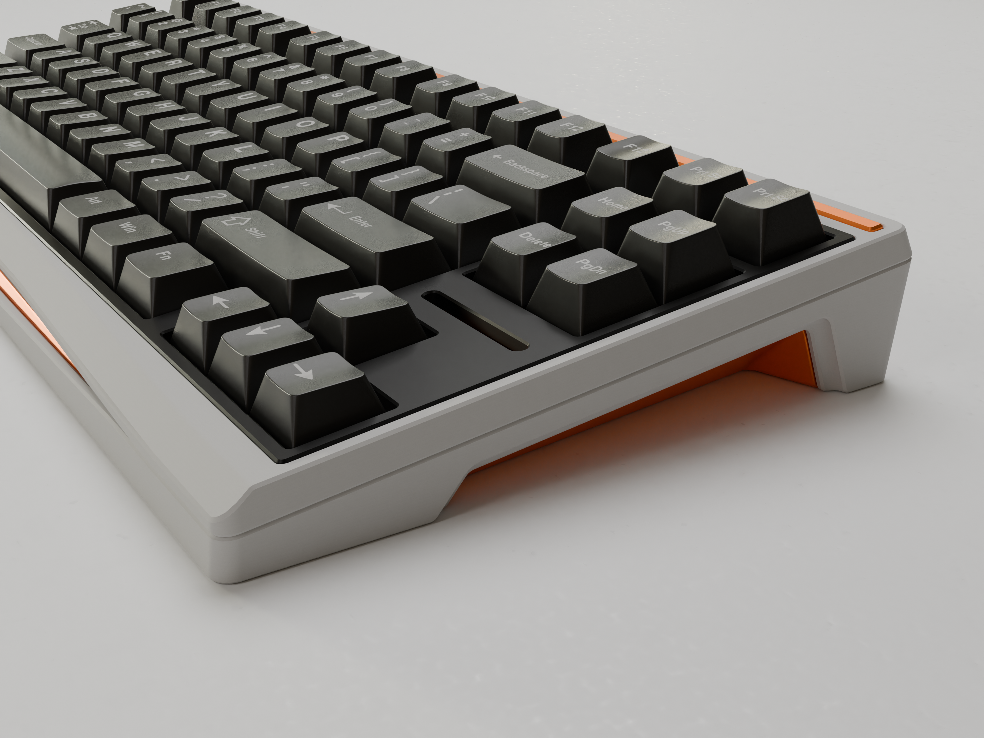
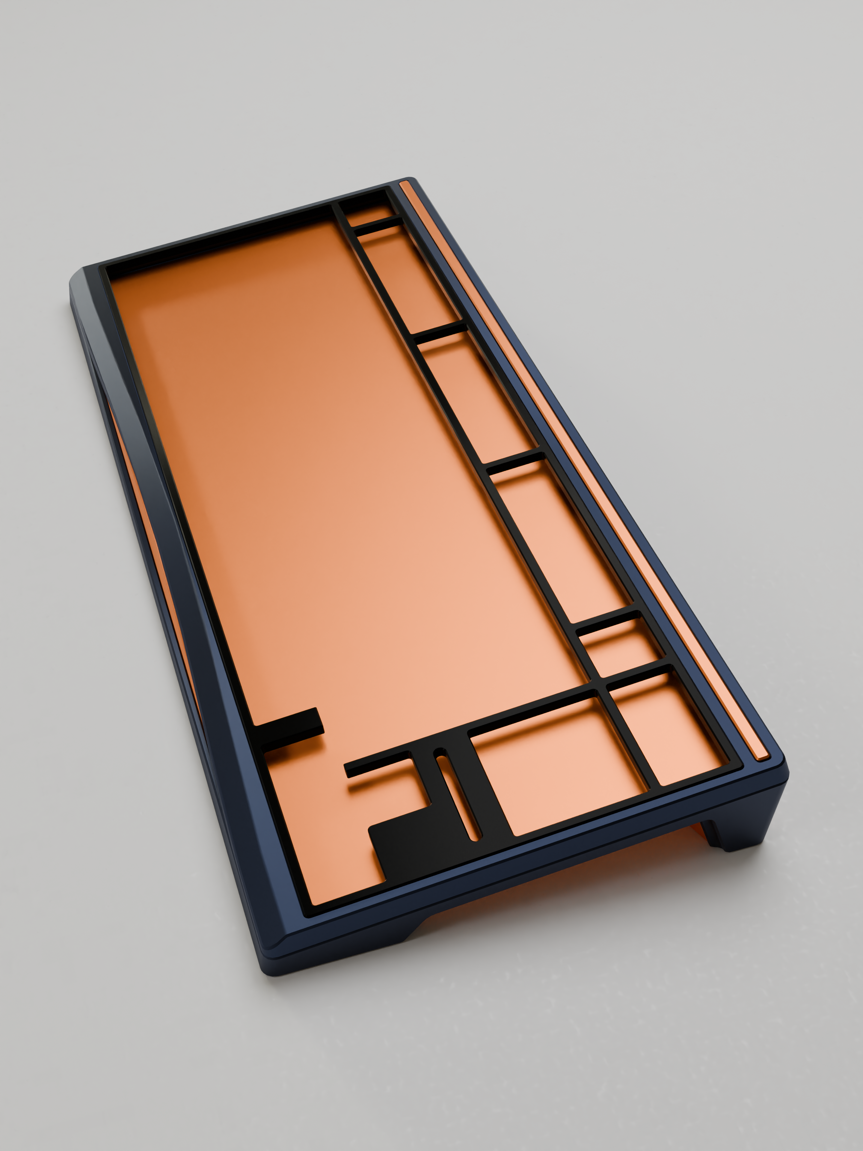
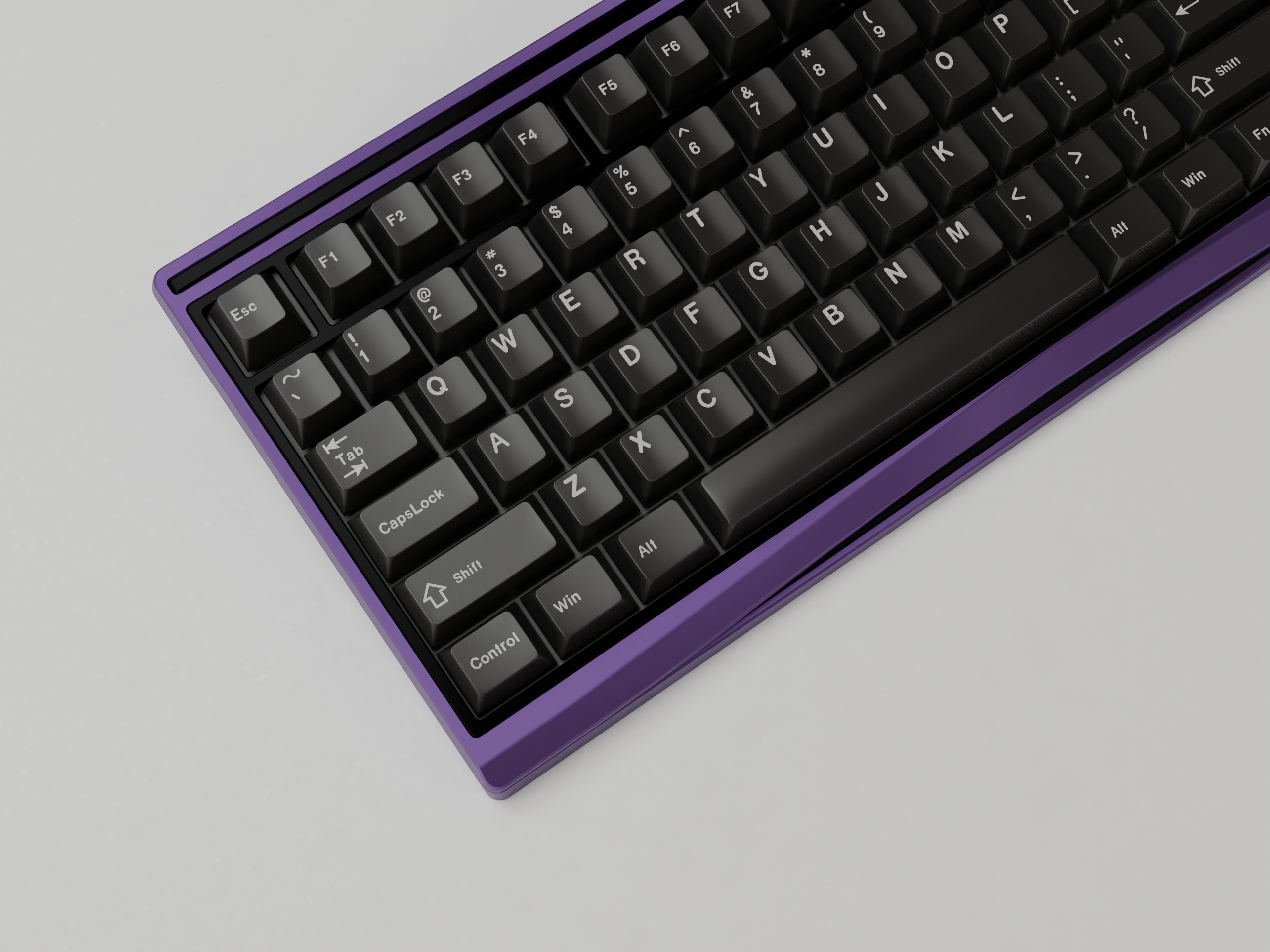
Concept 1
some text describing the concept direction
Concept 2
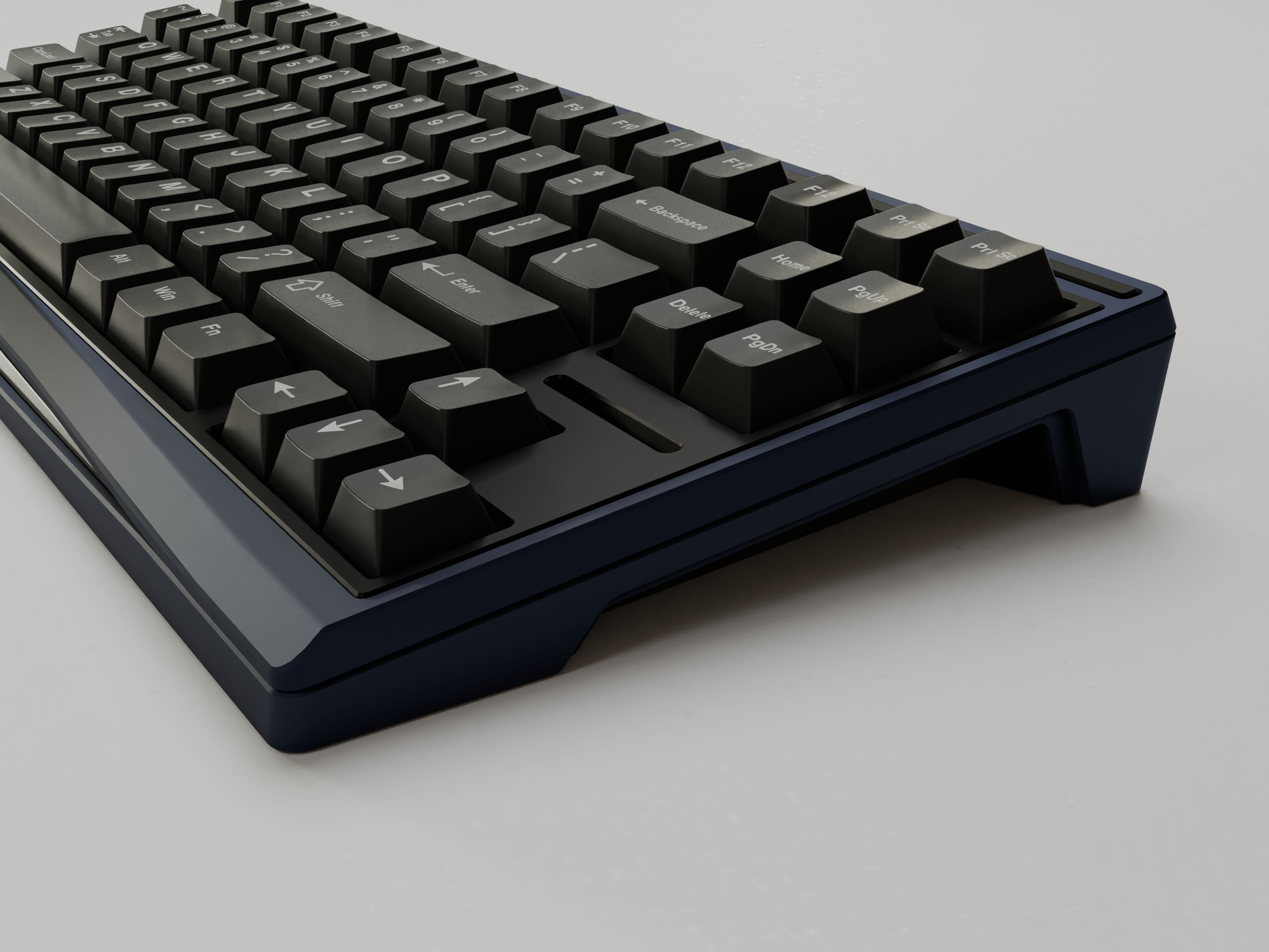
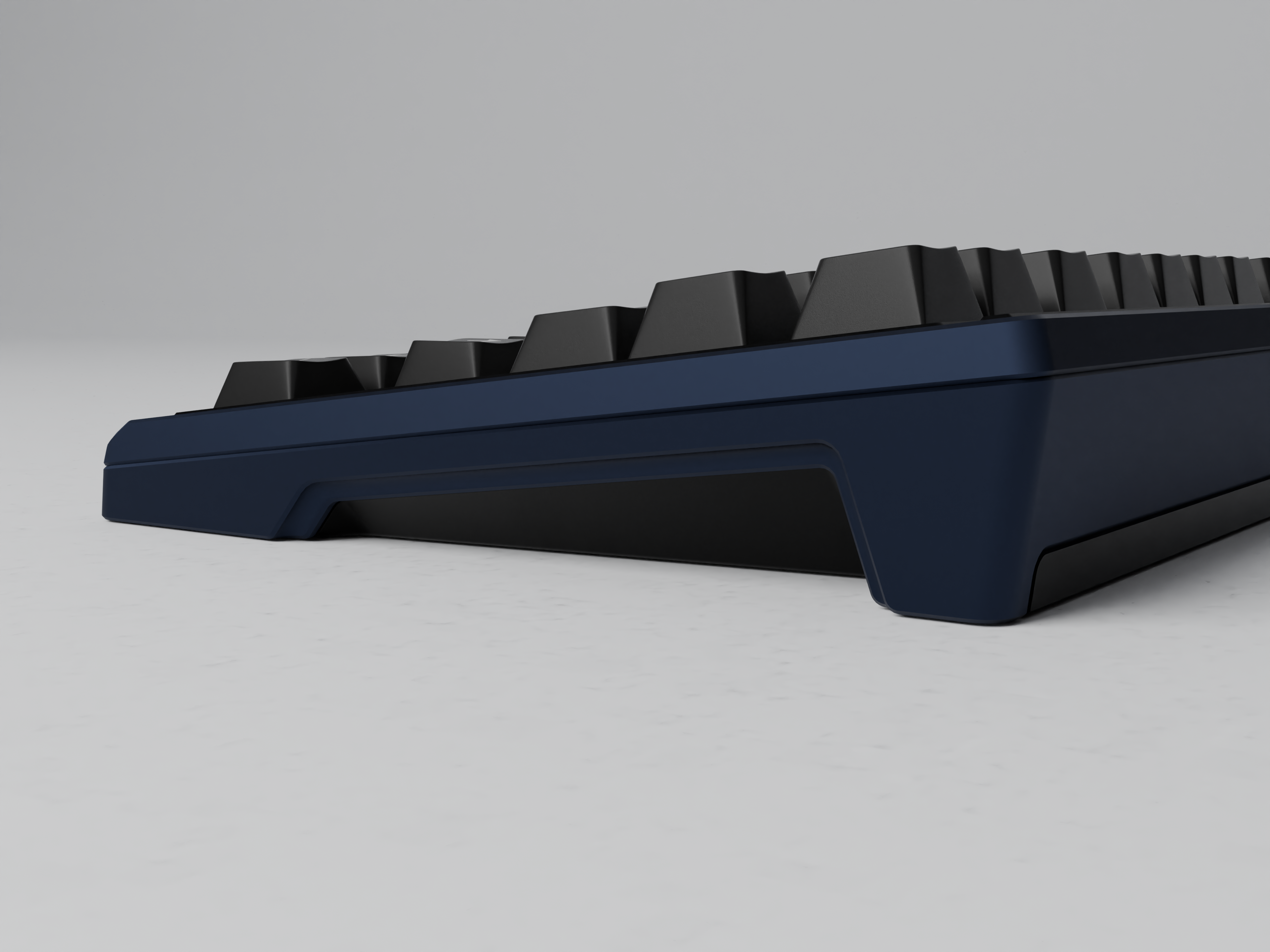
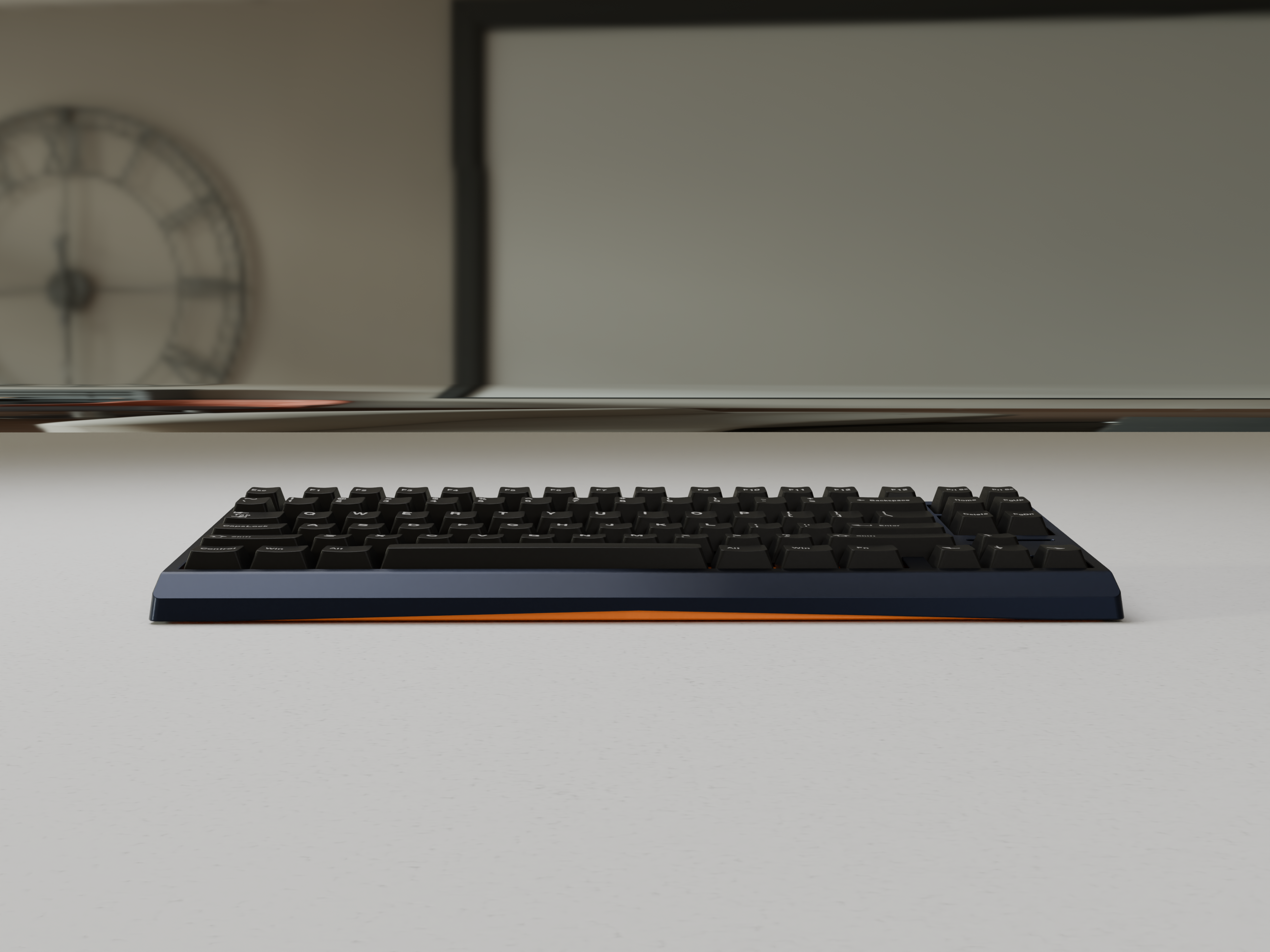
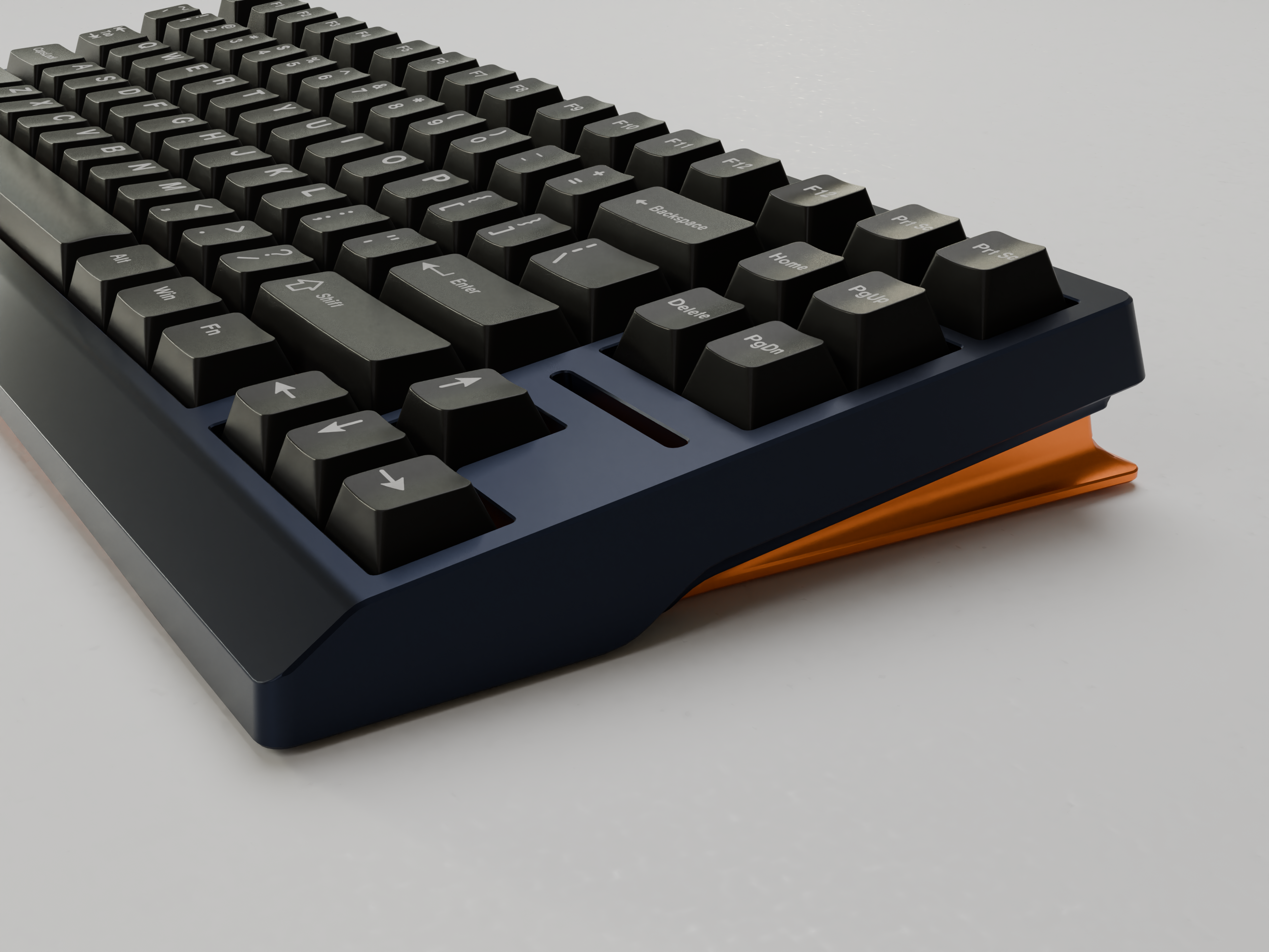
This concept aims to do as much as possible with as few parts. The focus is on a more simple expression, while introducing a more distinctive side profile to give the case some character.
Early Design Feedback
The concepts shown here are very early design explorations. Shapes, colors, and details are still work in progress and should not be considered final. The purpose of this page is simply to gather early impressions and constructive feedback before the designs move further.
Please feel free to share quick thoughts or reactions. Even short impressions are very helpful at this stage.